Wednesday, 24 February 2016
Our Fonts
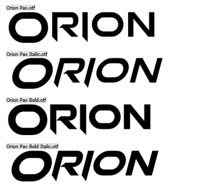
For our font choices for out title sequence, I have done a bit of investigating into which fonts in particular best suits the dystopian theme of our genre for the titles. After spending multiple and countless times searching through the website 'Dafont.com', I came across a font in particular that I felt really stood out and fitted very well for the font on our government's map. I used the font style of 'Orion' to achieve this as I felt as though it was bold and eye-catching, which is essentially what I felt was needed.
For the titles and names that appears during the title sequence, we again investigated and looked into different fonts within 'Dafont'. We finally came across a font in particular in which we again felt fitted the theme of our title sequence, with this font being the 'Dark Underground' font. We chose this font as we felt it appeared to look very gritty yet bold and again, eye-catching.

Subscribe to:
Post Comments (Atom)
No comments:
Post a Comment